Plotting: plotly & plotnine
Every plotting function in moderndive takes an engine= argument:
engine="plotly"(default) — interactive figures (plotly.graph_objects.Figure).engine="plotnine"— grammar-of-graphics figures (plotnine.ggplot).
The composition syntax is identical across engines, so you can switch a whole analysis by changing one argument.
Note
The figures on this page are static images so they render in the docs. In a
notebook or script, the default engine="plotly" produces interactive
figures (hover, zoom, pan).
import moderndive as md
from moderndive import (
specify, observe, get_confidence_interval,
visualize, shade_confidence_interval, shade_p_value,
)
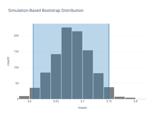
boot = (
md.load_almonds_sample_100().specify(response="weight")
.generate(reps=1000, type="bootstrap", seed=1)
.calculate(stat="mean")
)
ci = get_confidence_interval(boot, level=0.95, type="percentile")
ci
| lower_ci | upper_ci |
|---|---|
| f64 | f64 |
| 3.606975 | 3.75 |
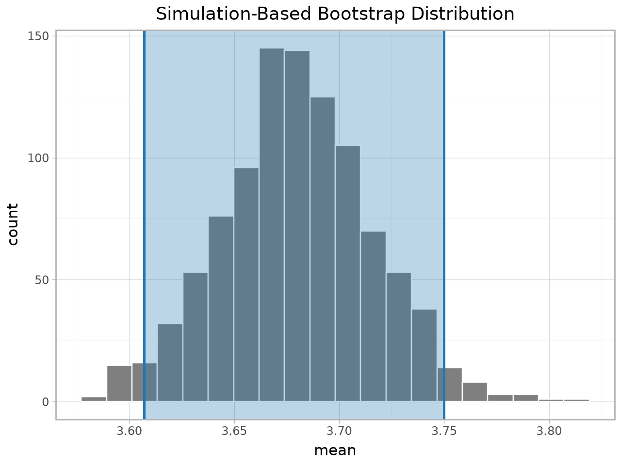
visualize() returns an InferPlot
visualize() returns a small InferPlot wrapper that you compose with shading via
+ in both engines. The underlying figure is on .figure (and, for plotnine,
the raw ggplot on .gg).
visualize(boot) + shade_confidence_interval(ci)
# the same plot via the plotnine engine
visualize(boot, engine="plotnine") + shade_confidence_interval(ci)
Keyword form
If you’d rather not use +, pass the shading inline (handy for plotly):
visualize(boot, shade_ci=ci)
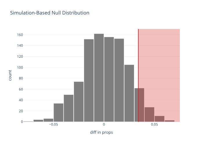
Shading p-values
spotify = md.load_spotify_metal_deephouse()
obs = observe(spotify, formula="popular_or_not ~ track_genre", success="popular",
              stat="diff in props", order=("metal", "deep-house"))
null = (
    spotify.specify(formula="popular_or_not ~ track_genre", success="popular")
    .hypothesize(null="independence")
    .generate(reps=1000, type="permute", seed=76)
    .calculate(stat="diff in props", order=("metal", "deep-house"))
)
visualize(null) + shade_p_value(obs_stat=obs, direction="right")
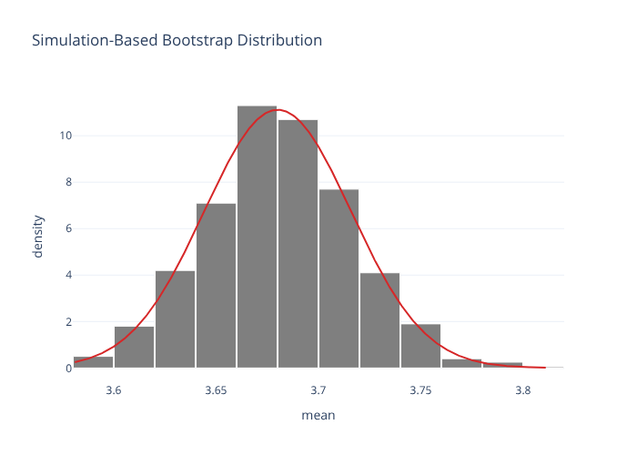
Simulation vs. theory overlays
visualize(boot, method="theoretical") # normal-approximation curve
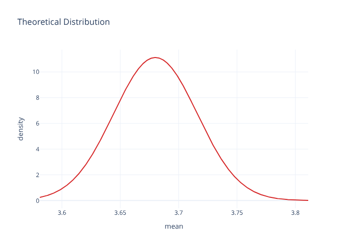
visualize(boot, method="both") # histogram + curve overlaid
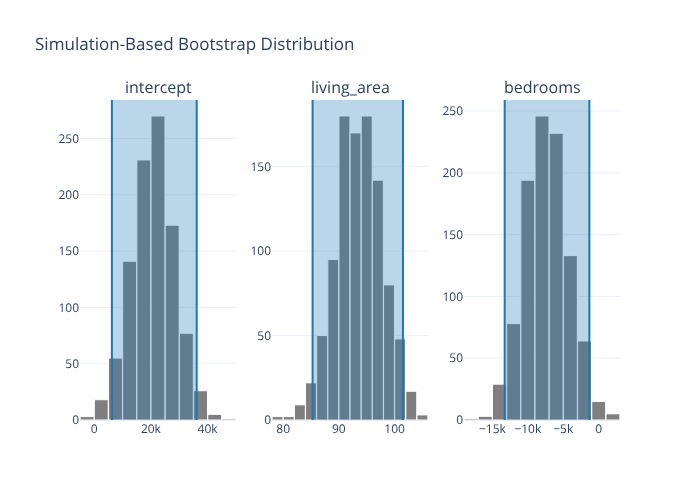
Faceted regression-coefficient plots
visualize_fit shows one panel per term, and shading is per-facet:
from moderndive.infer.viz import visualize_fit

houses = md.load_saratoga_houses()
boot_fit = (
    houses.specify(formula="price ~ living_area + bedrooms")
    .generate(reps=1000, type="bootstrap", seed=1)
    .fit()
)
visualize_fit(boot_fit) + shade_confidence_interval(boot_fit.get_confidence_interval())
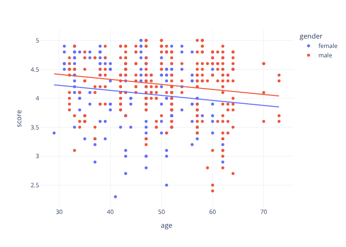
Model plots
from moderndive import gg_parallel_slopes

evals = md.load_evals()
gg_parallel_slopes(evals, response="score", explanatory="age", by="gender")
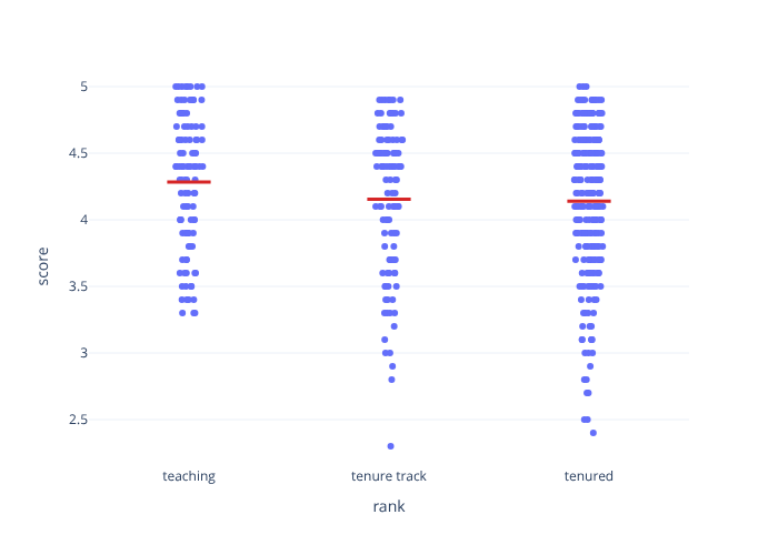
from moderndive import gg_categorical_model

gg_categorical_model(evals, response="score", explanatory="rank")
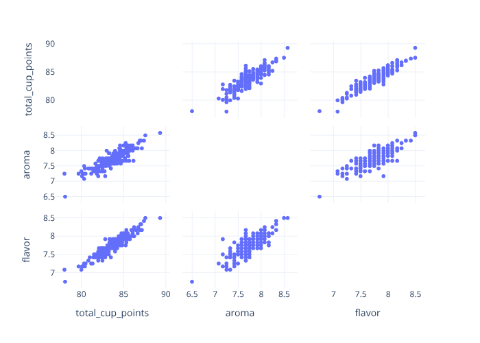
from moderndive import pairplot

# Scatterplot matrix (~ GGally::ggpairs)
pairplot(md.load_coffee_quality(), columns=["total_cup_points", "aroma", "flavor"])
Saving figures
p = visualize(boot)            # plotly
p.save("dist.html")            # interactive HTML (no extra deps)
p.save("dist.png")             # static image — needs: pip install "moderndive[image]"

g = visualize(boot, engine="plotnine")
g.save("dist.png", width=6, height=4, dpi=150)
pairplot(..., engine="seaborn") (alias "plotnine") returns a Matplotlib figure
if you prefer the seaborn-backed scatterplot matrix.